

The recycling symbol is arguably one of the most omnipresent logos in existence, an image that is recognized and understood at just a glance on millions of packages and containers across the nation. As far as recognizability goes, it is up there with Nike, Mcdonald’s, and Apple.
But the story of this symbol has changed alarmingly since it first started to appear. What used to be a symbol created in an innocent effort to raise awareness about recycling has been stolen and repurposed into a sorting and labeling system by the plastics industry that has all but destroyed the symbol’s purpose to begin with.
In this article, we will dive into the history behind this common symbol, and how its story went awry.
History of the Recycle Symbol
Increased public awareness around environmental issues led to the first Earth Day celebration in 1970. As part of this inaugural celebration, a national logo design competition was put on by Container Corporation of America which was, at the time, one of the top producers of recycled packaging materials in the country. The company’s founder had an affinity for progressive design trends, and this attention to branding detail quickly put the company in the lead.
Enter Gary Anderson. At the time, Anderson was only 23 years of age, working towards a degree in architecture at the University of Southern California. Though he wasn’t majoring in design, he decided to give the logo competition a try after becoming inspired at an environmental rally.
In “Seeing Green: The Use and Abuse of American Environmental Images,” Anderson recalls that his generation was just starting to understand that the Earth’s resources weren’t infinite. This idea of infinity would greatly inspire his logo design.
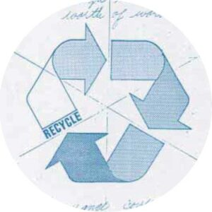
Anderson used the Mobius Loop as the core of his design. A Mobius loop, or strip, is a mathematical discovery that was made in the late 1800s. The main point is that it represents mathematical continuity and connection.
Anderson later wrote that “It didn’t take me long to come up with my design: a day or two. I almost hate to admit that now. But I’d already done a presentation on recycling wastewater and I’d come up with a graphic that describes the flow of water: from reservoirs through to consumption, so I already had arrows and arcs and angles in my mind.”
His original sketch displayed three arrows folding in on each other. It was meant to represent “both the dynamic (things are changing) and the static (it’s a static equilibrium, a permanent kind of thing).”
Anderson’s logo was chosen as the winner out of 500 entries at the International Design Conference at Aspen (IDCA). He was rewarded with $2,500 toward his studies for designing the winning entry.
Source: Dieline
How the Plastics Industry Hijacked the Recycle Symbol
Container Corporation of America (CCA), the host of the competition, then implemented the symbol on their recyclable products and began encouraging other companies to do the same. They had so much success with this endeavor that the logo ended up becoming public domain, which means it could no longer be trademarked.
Essentially, this was the beginning of the end for the recycle symbol. As a part of the public domain, anybody could take Anderson’s design and manipulate it for their own purposes.
Flash forward to 1988. The Society of Plastics Institute created a resin identification coding system to identify and label different types of plastic manufactured by a company. Although this system introduced a nice, clear way of labeling, it started a dangerous landslide of misinformation.
The main problem was that a product could have the recycle symbol with a number inside of it even if that material is not actually recyclable.
Due to a lack of clear education about the different forms of plastic and whether or not they are recyclable, this system is hardly efficient. Less than 9% of plastic manufactured annually is recycled. The rest often ends up in large landfills that are only getting bigger.
Compare this stat to Germany, the world’s leader in recycling, with a 56% recycling rate of all materials the country produces.
Source: Blue Line Labels
The story behind the recycle symbol begins with so much potential and purpose and morphs into a story of misrepresentation with irreparable consequences. It’s time for the plastics industry, the EPA, and the federal government to go back to the drawing board to see how the United States’ recycling efforts can be changed for the better.
And as for designers, use this story as a cautionary tale. Securing the legal protection of your designs is key to retaining ownership of your creations. We’ve learned how good design can quite literally change the world, we just have to ensure that we let it do so in the right way.