
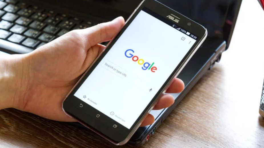
Around 75% of internet users who perform a search on Google never reach the second SERP (Search Engine Results Page). Therefore, SEO optimization services, offered by an online marketing agency, represent an ace up the sleeve of many online entrepreneurs or site owners.
But SEO optimization, of which many of us have heard more or less, is not a single, unique activity, but rather designates a whole process. This includes: analyzing, planning, on-page, and off-page activities, together with constant monitoring.
However, the term that best defines this process is “continuity”. In other words, improving organic traffic and obtaining the desired results, for example increasing the conversion rate, won’t just happen overnight.
Statistics show that, depending on the allocated budget for the SEO optimization process, the effort, and the efficiency of the implemented strategy, it can take anywhere between two and six months before the first results start to appear.
Further, by continuing with the SEO optimization, the increase in organic traffic will be exponential. The website will climb to the top of the SERP, gradually reaching the first positions for the targeted keywords.
However, apart from consistency, continuity involves adapting to the newest trends, a proactive attitude, as well as the capacity to react to change or different challenges in this domain.
For example, five years ago, Google announced a new major update, that today proves to be quite harmful to websites whose mobile versions are not correctly optimized.
Once this new algorithm debuted in March 2020, Google started to use the mobile-first index to determine results both for the mobile and desktop versions of a website.
Previously, Google indexed the mobile and desktop versions separately, using each of them to determine the positions within the SERP.
The page loading speed of a website gets, therefore, much higher importance following this update. Consequently, the text and graphic elements displayed on mobile should be easy to browse, as well as pleasing to the eye.
Otherwise, if the website is loading slowly and is visually tiring, the user will leave the page immediately, and the bounce rate will increase. This detail will send Google negative signals about the website’s UX (User Experience).
Therefore, here’s how you can simply and quickly improve the user experience from an SEO point of view:
- Use large fonts, of at least 14 pixels, as well as short paragraphs, made of 2 or 3 sentences. They should have around 60-70 characters each.
- Insert a representative image every 300 or 400 words, to break the box of text. Images will attract users’ attention and will keep them on the website longer, regardless if we are talking about the desktop or mobile version.
- Internal links require extra attention since they determine the navigability on mobile. These links, in the whole SEO optimization process, can substantially increase the time spent by users on your website (if they are placed how and where they should be placed).